
MoMA
The challenge
In the wake of the pandemic the Museum of Modern Art was forced to shut its doors to its beloved guests. Causing them to cancel upcoming exhibitions, reduce staff and ultimately lose money. They reached out to our team to create a mobile app to bring the in-person museum experience to its guests and bring back profits.
The team
2 UX/UI Designers (me) & 2 UX Researcher (also me)
The outcome
Introduced an augmented reality (AR) feature that would bring the works of art from the MoMA into the living spaces of users. with the goal of increasing.
Discovery
Prior to development it's imperative to understand not only what the client is asking of you, but to measure their requirements with the customers desires. In this stage of development we conducted several tests and interviews to uncover just that.
“The real voyage of discovery consists not in seeking new landscapes, but in having new eyes.”
-Marcel Proust
Every new story starts where the last one left off
Heuristics Test
The first stage of the discovery phase is to measure The Museum of Modern Art's website and mobile app to analyze where it was succeeding and where it might have room to grow.

- One dimensional: They need a more comprehensive app – as it stood it could only be used to hear audio information and you could only use it when you are physically there
- Remote events = more revenue: The goal is to generate more revenue and remain socially distant - it seemed they heavily highlighted their events which can be conducted remotely
- Curated art exhibitions: We were asked to make a comparable museum going experience and as it stood there wasn’t a solid way to show off their carefully curated content besides what was in their personal collection
Keep your friends close and your enemies closer
Competitive Analysis
Since we know where the MoMA app and website stood it was time to analyze what features other successful apps and websites were doing that we found exciting. We measured them up to the MoMA's desired outcome to determine if they were on brand or not. Once established we could then test our theories with museum goers.

The British Museum App 1
Contains information about the museum, scheduled events, a map and directions

Google Arts & Culture App
The augmented reality was done successfully and was intuitive

The British Museum App 2
A very simple app that was easy to navigate. It was only beneficial if you are at the museum. Offered membership benefits.
Never underestimate the power of listening
Initial Interviews
Now that we found a benchmark and turned our research into a discussion guide it's time to ask our users what they think.

To affinity and beyond!
Affinity Mapping
We then had to distill the data into concise usable information. We found the most people we interviewed were members and loved the benefits their membership provided. Additionally they loved AR/VR art exhibits if they were done tastefully and loved being able to interact or observe other museum goers.

Define
I know what the business goals are and what the museum goers need but before we put pen to paper we have to summarize our findings and personify our interviews. We wanted to be sure we knew the problem so we can develop the proper solutions.
“The first step is clearly defining what it is you're after, because without knowing that, you'll never get it."
-Halle Berry
Meet Sandra Reyes

So what's the problem?


Design
It's pen and paper time! Since we have an idea of the solution that best suites both parties we can start designing our solutions. We started with design studios to garner as many concepts for how the answer will look. Once we sifted through the sleek from the slumped and the silly from the serious we can put that into a digital platform, prototype and test.
“Design is a formal response to a strategic question."
-Mariona Lopez
Paper Sketches to Grayscale Prototype
To kick off the design process we held a few design studios to gain as many iterations and possibilities for layout and design. We took the MVP's from each team members sketches to carry on to our greyscale prototype.

From Digital Greyscale to a High-Fidelity Prototype
We tested our greyscale prototype with three people to gain further insight into the functionality of our designs. We found that the process of finding the tours was confusing. In addition we found that menu didn't contain enough relevant content for the users. So we made adjustments to the hierarchy of information on the homepage and placed links to the tours right in front of the users. Increasing the effectiveness of our navigation

Finalized Features and Key Changes for our High-Fidelity Prototype
We underwent two more rounds of usability testing with our high-fidelity prototype. From these tests we found that we needed to adjust and refine our onboarding to make our features more accessible and enjoyable.
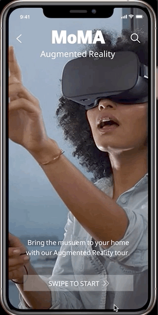
Onboarding for AR
We wanted to make it as clear, concise and safe as possible. So we added warning messages, and tried to minimize it to just a few key screens that really summarized the experience.

"I would pay for a premium membership to see sculptures in my living room."
Many of the testers expressed disinterest in seeing paintings in their living room. However they were stoked to see sculptures to scale. Even mentioning they would pay extra money for this feature. We listened and promptly added that feature.

"I can't tell what's on each floor of the map"
The original map was hard to navigate. It had a legend but it wasn't as intuitive as we first imagined. We broke it up by floor and content. This allowed the users to have a sense of what they'd see on each floor before diving in.

"I wish I knew that I started a tour"
Our testers indicated that the structure of our information didn't make it clear that were starting a tour. So we reorganized the steps by putting the map after you select virtual tour we found it made more sense to our audience.
High-Fidelity Prototype
Where do we go from here?
-We want to add features that can enhance user's in-person experience as well. We don't want this to just be used outside of the museum. It needs to be a tool that people can utilize post-covid as well
-Focus on accessibility: Test on users with varying accessibility issues. Everyone should be able to enjoy art so we want everyone to be able to enjoy this app.
-Perfect the augmented and virtual reality